
project
720
Designing the Logic Behind Personalized Learning Paths
I designed an authoring environment that helps teachers and content developers structure adaptive learning paths, define progression rules, and connect them to the lessons students experience.
Ministry of Education's Project 720 · Product Designer
context
Project 720 is a Ministry of Education initiative aimed at advancing personalized, data-informed learning. AMIT participated in the initiative as one of the organizations developing a solution within this broader program.
The adaptive-learning layer was built into AMIT's existing learning platform. While students continued to experience a regular digital lesson, teachers and content developers could work behind the scenes to define multiple learning paths and the conditions that determine how students progress between them.
My role was to design the authoring experience: making a complex system of paths, stages, learning segments, and transition rules understandable and manageable without forcing educators into a single content-creation workflow.
The challenge
Making Non-Linear Learning Logic Understandable
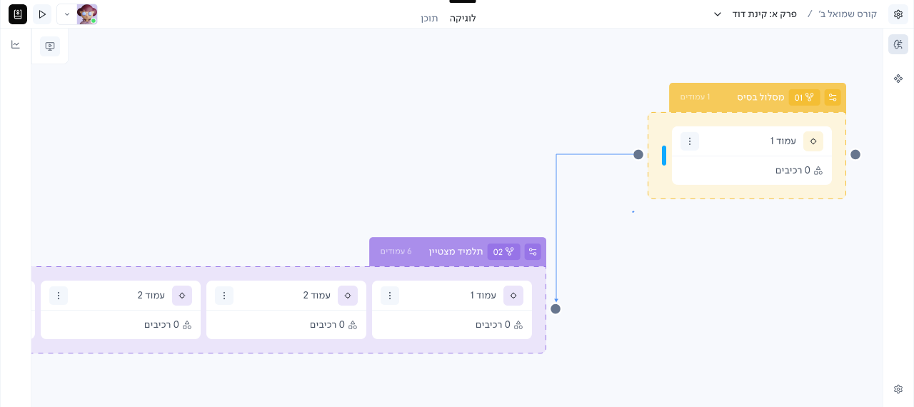
A single lesson could contain several parallel learning paths, each with a different structure. One path might include multiple learning segments within a stage, while another could contain only one, or skip that stage entirely.
Teachers and content developers needed to understand these paths side by side, define how students move between them, and work either from the learning content or from the adaptive logic itself.
The challenge was to make this complexity visible and editable without forcing every learning path into the same structure.
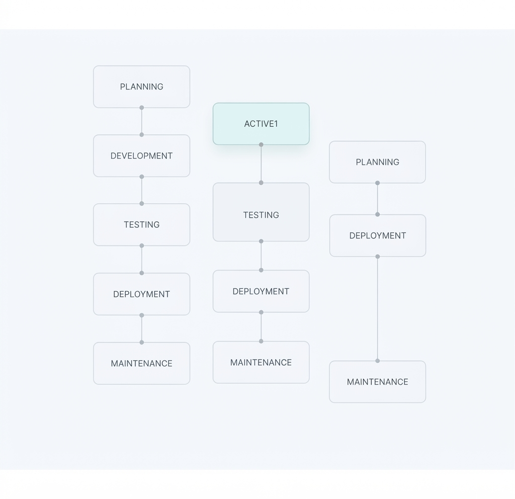
Parallel learning paths could vary in length and structure, making the progression logic harder to read at a glance.
The solution
A Visual Editor for Adaptive Learning Logic
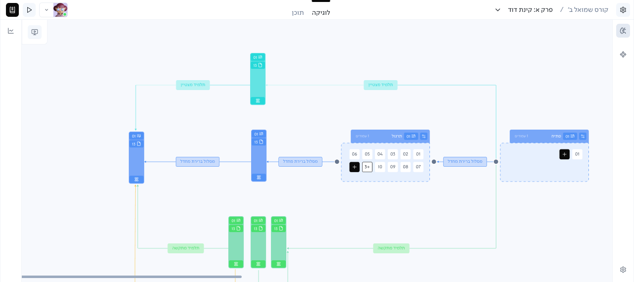
I designed a visual layer where teachers and content developers could structure parallel learning paths, connect learning segments, and define progression rules.
The logic lived alongside the existing lesson Builder, so authors could start either from the content or from the adaptive structure. For students, the complexity stayed behind the scenes while they experienced a regular digital lesson.
PRODUCT DECISION 01
Making Uneven Learning Paths Comparable
THE PROBLEM
Parallel learning paths did not follow the same structure. One path could contain several learning segments within a stage, while another might contain only one or skip that stage entirely.
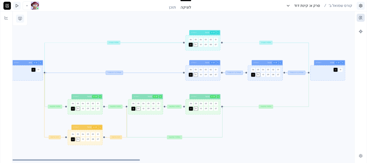
Without a shared visual reference, it became difficult to understand how the paths aligned and where each segment belonged.
DECISION
Use the Canvas Grid as a Shared Reference
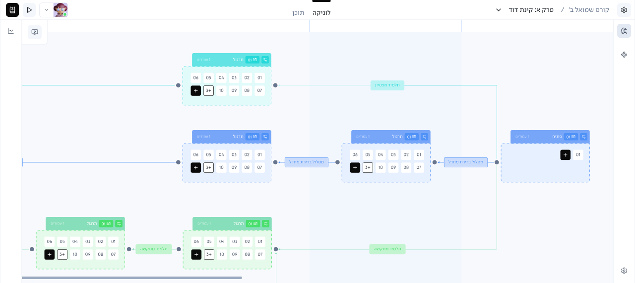
I introduced a grid behind the canvas, using the stages as a consistent visual reference across all learning paths. The paths themselves remained flexible: they could contain different numbers of segments or skip stages, while the grid made their relative structure easier to scan and compare.
MY ROLE
I identified the readability problem and defined the visual hierarchy and grid behavior for the canvas.
OUTCOME
The structure of parallel paths could be understood without forcing them into identical layouts.
PRODUCT DECISION 02
Letting Authors Control Information Density
THE PROBLEM
As learning paths grew, nodes could contain many pages and become visually large. Showing every page and its details across multiple paths made the canvas harder to scan when authors wanted to focus on the overall learning structure.
Different tasks also required different levels of detail. Sometimes authors needed to inspect the content inside a node. Other times, they only needed to understand the structure and connections between paths.
DECISION
Provide Multiple Levels of Detail
I designed multiple visibility levels so authors could control how much information remained visible on the canvas:
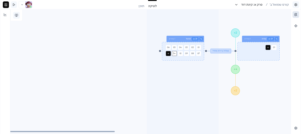
Expanded
Shows each page individually, including its component count and page-level actions such as moving or deleting it
Compact
Reduces the node to a lightweight representation of its pages, keeping mainly the page numbers visible.
Hidden
Removes the node details from view when the author wants to focus on the broader path structure, while indicating that hidden content still exists.
MY ROLE
I designed the different node visibility states and how users move between them, balancing page-level information with the need to scan larger learning structures.
OUTCOME
Authors could control how much information was visible on the canvas, from page-level details to a reduced structural view, depending on what they needed to focus on.
OUTCOME
A Flexible Foundation for Adaptive Learning
The final product gave teachers and content developers a visual environment for defining learning paths, progression rules, and adaptive logic alongside the existing lesson Builder.
The product was launched after I left the project, so I don't have validated usage data or post-launch results to report.
REFLECTION
What I took from this project
This project reinforced that complex logic does not need to be simplified by removing flexibility. Sometimes the better challenge is to make that flexibility understandable.
It also pushed me to think beyond individual screens and design for different levels of focus, from detailed page-level work to understanding the structure of an entire learning path.